USE CASE
Visualize election results with interactive charts
Election results are more than numbers – they’re stories of communities and change. Flourish helps you turn these stories into engaging visuals with no-code templates, perfect for journalists and data enthusiasts. Present every election stage with clarity, depth, and creativity.
Parliament charts
Parliament charts (also called hemicycle charts) show seat distributions by party in a semicircle layout that reflects real-world parliaments. The Flourish Parliament Chart template offers:
- Adjustable number of seats for any country
- Optional majority line for quick insight into outcomes
- Animated seat change for before/after comparisons
Election Results charts
The Election Results Chart is a simple and effective way to visualize election outcomes. It displays the number of seats each party has won, using different colors for easy identification. Use the Flourish Election Results Chart to:
- Add dropdown filters for country view
- Automatically calculate historical comparisons
Custom grid positions
Want to visualize election results spatially, without a geographic map? Use our custom grid layout to build flexible, screen-responsive visualizations shaped like your country or region.
- Assign X/Y coordinates to each area to customize the position
- Create map-like layouts that adapt to any screen
USE CASE
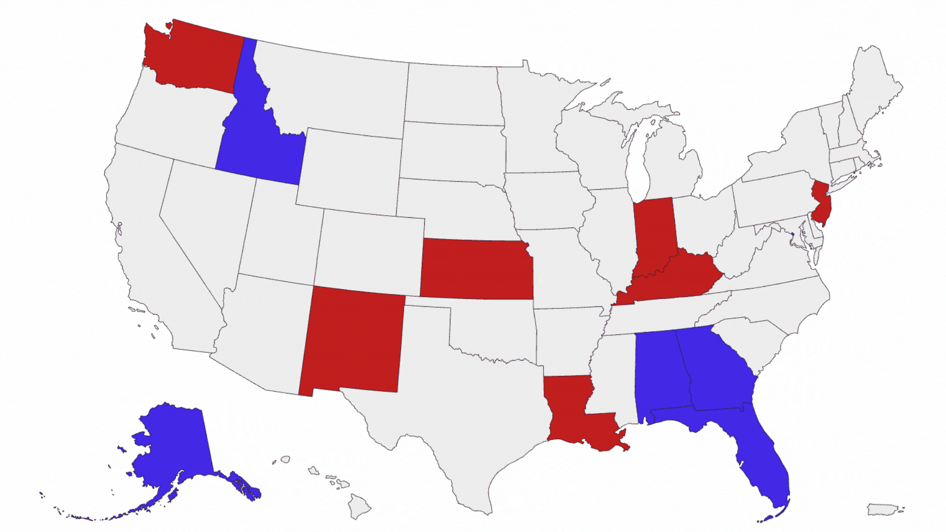
Visualize elections data with maps
When it comes to sharing election results, there's a compelling way to engage your audience – by adding a geographical dimension. In that way, your story moves beyond just who won, to where their support was strongest. This method isn't just informative; it adds depth and context to the understanding of the election.
Various mapping techniques can bring these dynamics to life. Traditional state or county maps provide a familiar, detailed view of the electoral landscape. On the other hand, a hex map offers a fresh perspective – it's unique and
visually striking, yet maintains clarity and precision.
Using
Flourish maps, you have the flexibility to tailor the presentation to your needs. Use maps to:
- Show vote share or turnout by region, district or country
- Highlight margins of victory
- Compare results with hex maps or cartograms
USE CASE
Track voter sentiment with polling data visualizations
Polling data refers to the information collected through surveys and
interviews to gauge public opinion and predict electoral outcomes. Typically conducted by polling organizations or research firms, these polls aim to capture the preferences and attitudes of a representative sample of the
population. Polls play a crucial role in informing political strategies, shaping public discourse, and providing insights into the potential outcome of an election.
Visualizing polling data help to convey trends, patterns, and relationships in the data, enabling people to quickly grasp the overall picture of public opinion.
Line chart race
In Flourish, you have several options to create a voting intention chart. Our Line Chart Race template is particularly good for visualizing the polling of volatile races because the animation gives you an almost physical sense of the contest — the peaks, the troughs, the changes in position.
Scatter plots
You can use our Scatter template to create a voting intention chart. The
visualization below shows support for the two US political parties, using
polls to determine who voters want in congress. Using the Scatter template, we
can combine individual polls (visualized as dots) and the
overall average (visualized as line) for each party.
Add a legend filter to let users explore one party closer or add
automatically updating timestamps
to inform readers about the actuality of your data.
RESOURCES
Master every stage of election reporting
From polling to final results, these resources will help you tell better stories with election visuals
16 ways to visualize elections
Choose the right chart type for every stage of your election story, whether you’re tracking vote share, visualizing turnout, or explaining seat changes.
Read the guide →
Data visualization tutorials
Watch real examples of how to bring elections data to life using Flourish. This webinar covers how to create impactful visualizations for polling, results, turnout, and more.
Watch the webinar →